Fred Smeijers. Counterpunch: making type in the sixteenth century, designing typefaces now. Edited by Robin Kinross. First edition, 8vo, 191p, illustrations, 22cm, London: Hyphen Press, 1996.
Diagrams and illustrations within the text. Semi-stiff covers in orange, blue and white. A fine copy.
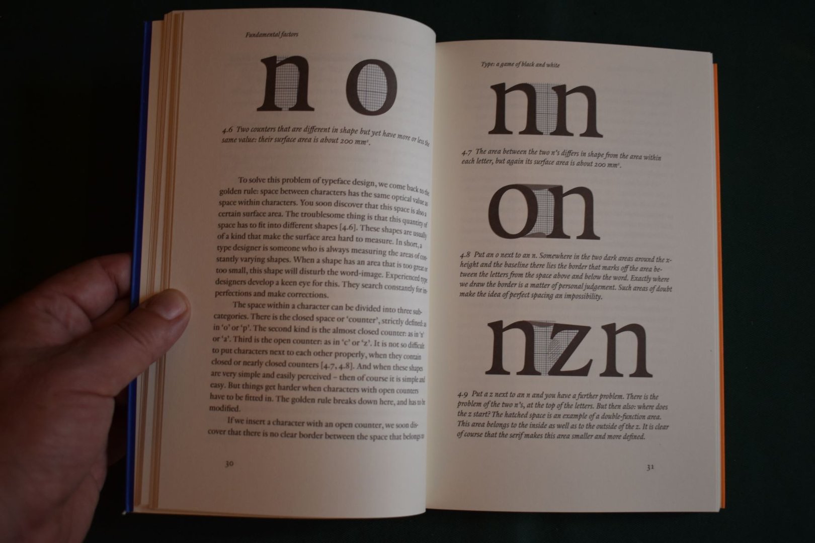
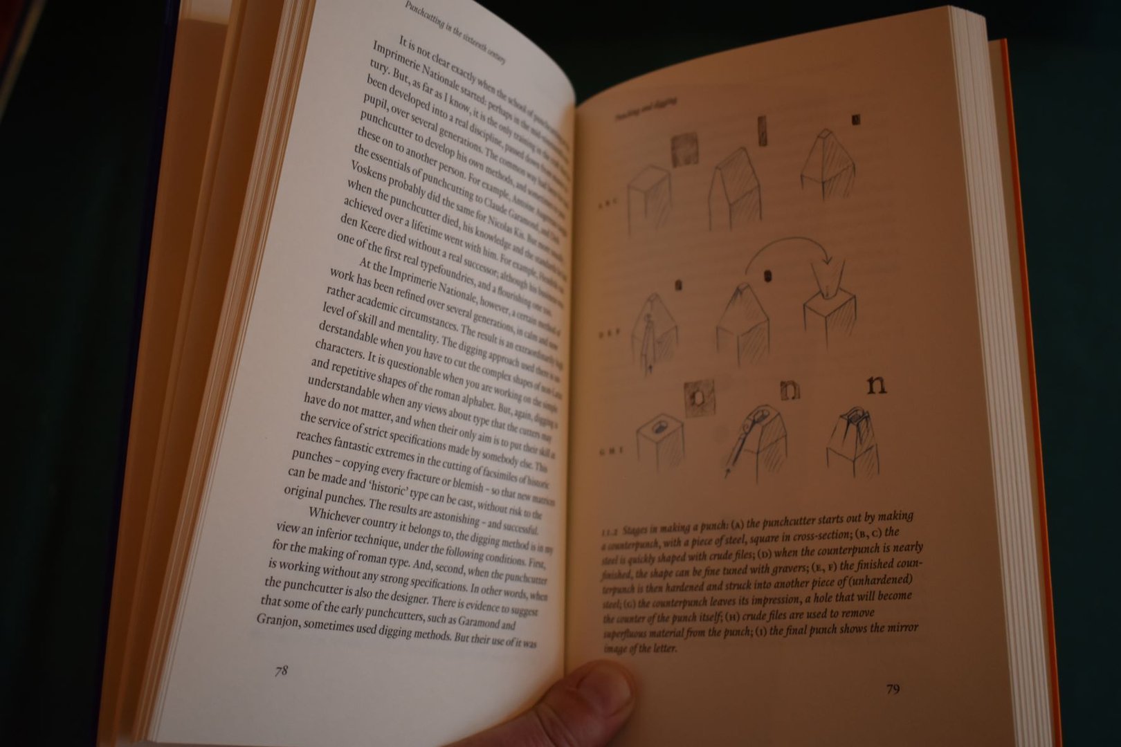
The three ways of making letters; Type, a game of black and white; Comparing typefaces; Letters and the Italian intellect; The place of the punch in type production; The punchcutter and historians; Where does the punchcutter come from? The rise and fall of the punchcutter; Punching and digging; The delights of steel; Fournier on punchcutting; How did they really do it? Fixing the image; Sequence of design and production; One punch a day? Where are the punchcutters? Henrik van den Keere and outlines; Linearity; Does technique influece form? The unconscious eye; Punchcutting in the digital age; Type design and language; The limits of roman; Openings and changes; Hendrik van den Keere.